• +91 9363019991
  • info@redwudcreations.com
  • chennai
Blog
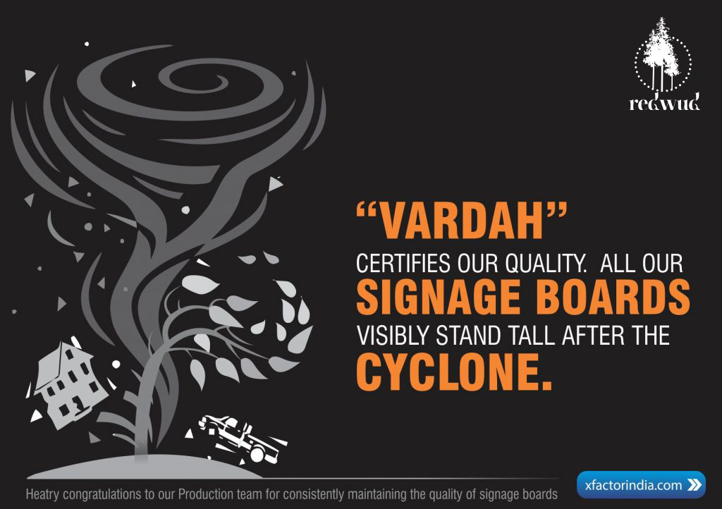
“Vardah” CERTIFIES OUR QUALITY

“Vardah” CERTIFIES OUR QUALITY

From yesterday, we have been getting calls from clients. “Except for those sign boards you erected that is on the top of the building, all the other boards have flown away in cyclone.”

Similarly, another doctor called and said, “Baskar, you have passed”. Baskar wondered what it was about. The doctor said, “All boards have been blown away by “VARDAH” on my road. But my board is standing still”. When we visited the site, we noticed the same.
We, at X Factor were gratified. We have always thought that our production unit is good and quality conscious. But, as a non-technical person, I personally felt that this could never be demonstrated and there will always be a tug-of-war with the client regarding the costs.
Why are these boards considered so important?
Are they part of Marketing?
VISIBILITY MANAGEMENT- Vital for Brand Health
Visibility is very important for organisations, which are in Retail. Hospitals need the best possible visibility to establish their brand. It is not just the premises but also the effective Visibility management that communicates the hospital’s services and uniqueness.
MCI: With MCI’s strict ‘no advertising’ rules, these boards are a boon for hospitals.
They convey the highlights of the hospital to the passers-by. Nowadays hospitals are spending more time on making their front elevation or facade – not only attractive, but also meaningful. I would strongly recommend that you communicate your service offerings to passers-by even if you do not spend time on beautifying the looks.
Hoarding in Premises – Expensive advertising becomes free advertising.
We all know that to advertise in a billboard / hoarding is very expensive. Instead, you can have a nice place earmarked inside your premises for your own hoarding. It is a very effective tool to communicate various schemes, new launches etc. Every big hospital right from Apollo erects many such hoardings in its premises, from the car park to gates to their walls. Make absolute use of all possible places to COMMUNICATE. The beauty is you can keep changing only the flex and this is less expensive.
Case Study 1: A Diagnostics center chain.
Though the External Signage boards had a meaningful and standard design, there was a challenge in maintaining consistency because the “Service Offerings” of the chain were not uniform. Still, we went ahead making a CT Scan picture on the Sign board in one of the centers at Madipakkam within the design template. Similarly, in T. Nagar center which alone offered MRI, we incorporated it in the template for the 20×4 board. The elegance was maintained and the purpose served.
Case study 2

Once we were asked to assess the visibility and recommend new places for putting up boards in a hospital, that according to our client, lacked visibility though situated in a central location. We found that all the existing boards were in the right places.   Then one of my junior production boys called me to say, “It is not the location madam, it is the Size!”   That was a ‘Eureka’ moment. The existing boards were enlarged to 4 times their original size, to get a better visibility.  The hospital brand gained respect and reputation through the visibly powerful boards.


Visibility management includes putting up boards of different shapes / types even shapes at

  • Road corners – Direction boards
  • Patient navigation points
  • Signals
  • Shops / Pharmacies
  • Other Nursing Homes (co-branding)
  • Other clinics etc.


Methods vary. Innovation is the key.  

Strengthen visibility


Construct a neat on site hoarding with excellent visibility from all approach roads after a thorough assessment.  Professional assessment is vital in deciding ‘where’ exactly to put up ‘what’.  The assessment team arrives at a conclusion after travelling to the hospital by bus (if there are busses crossing the site), bike, car and on foot. This is the foolproof method of accurate placement. Get your hoarding location spot on.


It’s ok to tweak your logo slightly


It is an accepted practice to tweak the logo, play with size and elements (if needed) ONLY for signage, because sometimes it may be impossible to depict logos as per Brand Identity manual guidelines.  Some colors can be challenging to adopt for display across day and night, due to their peculiar reflection and refraction properties, specific materials may be required. It is OK to adapt long names or by-lines.  It is to be noted that the message should be bold and clear not necessarily exhaustive.